-
“818 Brewing” Rebrand
This was initiated as a logo rebrand but the project was eventually cancelled. I scraped most of the original logo elements and ended up with this clean circler direction. With the use of the diamond shapes it almost has that cut paper feel. I really like how this turned out. My hope is that someday this project will resurfaces.
Continue Reading ? -
St. Joachim Golf Tournament
Another years golf tournament logo for my niece and nephews grammar school. I wanted to take a “hand done” approach to this years logo to reflect a grammars school aesthetic.
Continue Reading ? -
Whisky Labels
Shot this image at my home bar. I love this ultra-minimal whisky label (don’t know who the designer is?) . A true practice in design restraint. Interesting collaboration between “Kings County Whisky” and my favorite chocolatiers “Mast Brothers Chocolate” out of Brooklyn NY.
Continue Reading ? -
MacLeod Ale “Gift Card” Promotion
A quick 00:27 second holiday promo video to let everyone know that MacLeod Ale now offers Gift Cards. I wanted to keep it simple and clean with a fun opening message to engage the audience. Video was scaled down to 00:15 for an Instagram post. Project also included Gift Card design.
Continue Reading ? -
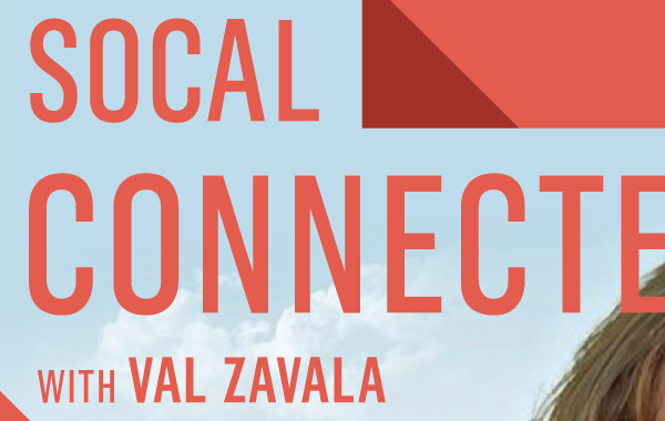
KCET “SoCal Connected” Print Ads.
I’m really liking the updated direction KCET has taken on “SoCal Connected” branding. Here’s an “LA Times Ad” and “Banner Ad” I recently completed that showcases a
Continue Reading ?